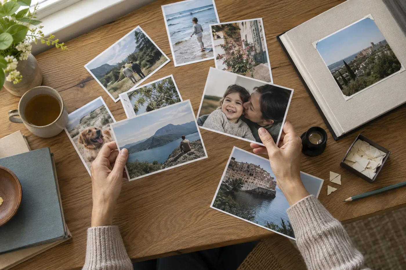
The best photograph for a custom gift is not always the most polished one. Emotion matters. A spontaneous kitchen snapshot may carry more meaning than a formal portrait, but it still needs enough information to reproduce clearly.
Begin with the original file
Use the image from the camera or phone that took it. Screenshots, messaging-app downloads and social-media copies are often compressed. That lost detail may be invisible on a small screen but obvious in a large print.
Check the file dimensions rather than judging only by megabytes. More pixels give a printer greater flexibility. If a shop warns that resolution is low, choose a smaller format or another file instead of assuming software can recreate missing detail.
Read the light
Faces should remain visible without extreme brightening. Window light, open shade and late-afternoon outdoor light often print gently. Deep shadows and colored nightclub lighting can be meaningful, but they need careful treatment. Avoid aggressive filters, which can create unnatural skin tones and blocked shadows.
Leave room to crop
Product shapes differ. A square cushion, tall phone case and wide canvas cannot use the same crop. Choose an image with breathing room around people, pets or important landmarks. Keep faces and text away from the edge.
Choose one emotional center
A photograph reads more strongly when viewers know where to look. Large group scenes can work in albums, while a mug or small print benefits from fewer subjects. Zoom out on your screen to approximate the final viewing size. If the meaningful detail disappears, choose a simpler image.
Black and white can unify difficult color
A monochrome conversion may help when clothing colors clash or indoor light creates mixed tones. It will not repair blur, but it can make a busy moment feel calmer. Preserve a copy of the color original and compare both before ordering.
Match the surface to the image
Glossy paper can add saturation and contrast. Matte finishes reduce reflections and suit soft portraits or art-forward interiors. Textured canvas is forgiving at normal viewing distance but can obscure tiny facial detail. Metal and acrylic surfaces often heighten color and sharpness. The subject and room should guide the finish.
Review the proof at full attention
Check eyes, hands, horizons and any visible words. Make sure no person is cut at an awkward joint and no important feature falls into a wrap area. If the design includes text, verify it separately from the image.
Run a small-screen test
Reduce the preview until it is roughly the size of the finished object as seen from a normal distance. A face that only reads when enlarged may disappear on a mug or small desk print. Then check the image once more at full size for blur, compression blocks and halos created by filters.
If the photograph matters but the file is weak, choose a smaller print, include it as one image in a photo book, or pair it with a short caption. Honest scale usually produces a better result than aggressive sharpening.
A technically perfect file is not required for every small gift. The aim is to respect both the memory and the medium. Choose the image that matters, then give it the scale and finish it can handle.
About the author
Pugac Editorial Desk creates practical, independently organized guides to meaningful objects and visual storytelling.