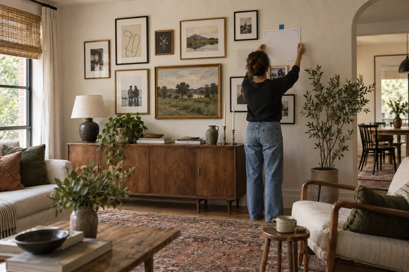
A good gallery wall is less about filling space than giving different memories a relationship. The arrangement can grow over time, but a few boundaries keep it calm.
Choose a loose theme
Your theme might be family, travel, local landscapes, botanical shapes or simply a color mood. It does not need to be literal. A wedding photograph, abstract print and handwritten recipe can coexist when their palette or emotional tone connects.
Start with an anchor
Select the largest or most meaningful piece first. Place it near the visual center, then let smaller works move outward. The anchor prevents an eclectic group from feeling weightless.
Limit one variable
If the art is varied, repeat frame color. If frames are mixed, keep spacing consistent. If sizes differ dramatically, use a restricted palette. One repeated element gives the eye a route through the collection.
Plan on the floor
Arrange everything on the floor within dimensions matching the wall. Begin with a gap of roughly two to three inches and adjust for frame size. Photograph promising layouts so you can compare them.
Make paper templates
Trace each frame onto scrap paper, mark the hanger position and tape the templates to the wall. Stand back from the doorway and from normal seating height. This inexpensive step reveals whether the group is too high, too wide or unbalanced.
Mix memory with visual rest
Not every piece needs a detailed story. A field of color, line drawing or simple landscape can give photographs and text room to breathe. Empty wall between frames is also part of the composition.
Leave space to grow
An asymmetrical edge makes future additions easier. Keep notes about frame finishes and print sizes, but do not wait for a perfect final collection. A living gallery wall becomes richer as new work arrives.
Measure from the furniture, not the ceiling
A gallery above a console or sofa should relate to that furniture as a group. Keep the overall arrangement narrower than the piece below it and begin low enough that the two elements feel connected. In an open hallway, use average eye level as a starting point, then adjust for the shapes of the frames.
Before making holes, view the paper template layout in morning and evening light. Reflections may make glass-fronted art difficult to see, while direct sunlight can fade sensitive photographs and works on paper.
The result should feel like your home, not a showroom. Use pieces with real resonance, create a visual rhythm and let the collection remain open to the next chapter.
About the editor
Pugac Editorial Desk creates home and visual-storytelling guides with a focus on practical scale and personal meaning.